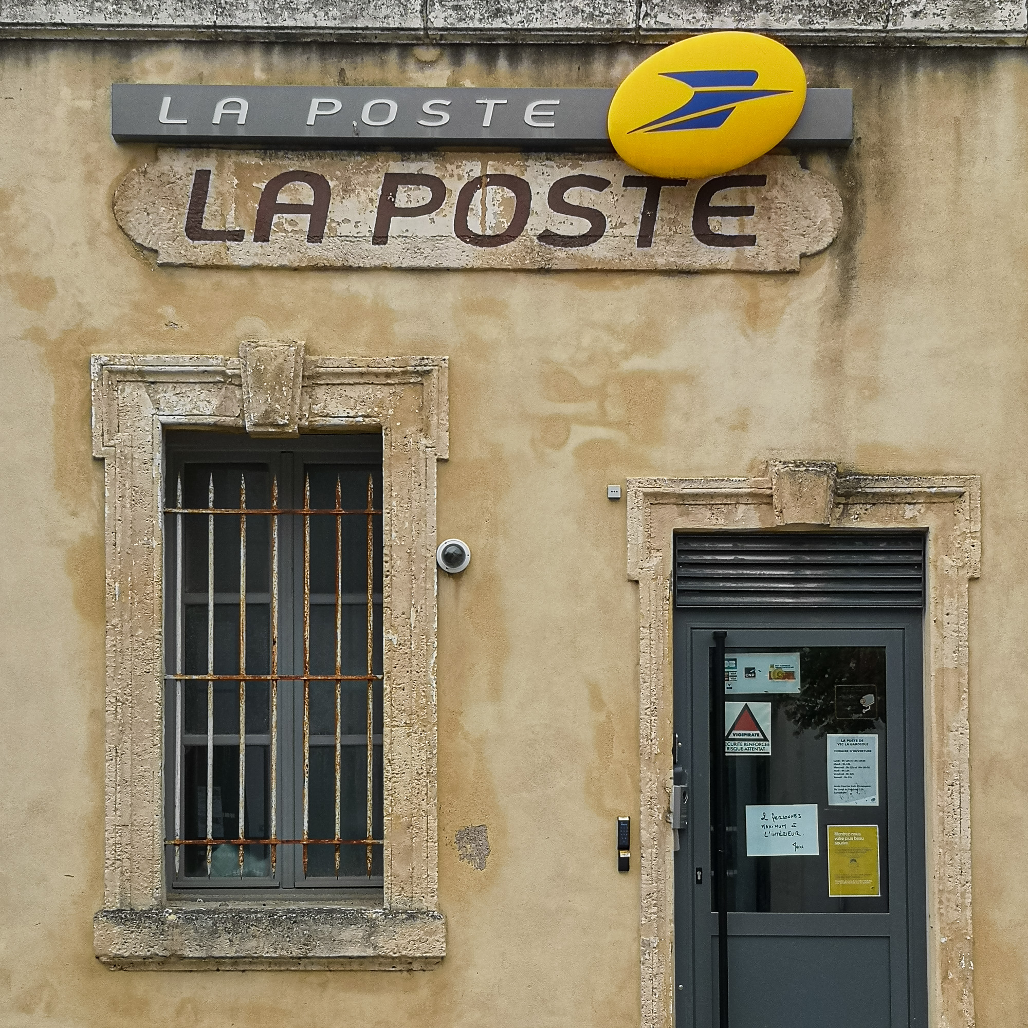
In 2010, La Poste unveiled its new logo. It should better reflect its ambitions within the society. The new logo was meant to convey a “more dynamic and contemporary face” and the idea of a stronger company. They were not quite sure about this everywhere and preferred to leave the old version hanging as well.
The logo, however, did not represent a change: It contains the colours yellow and blue as well as the well-known stylised bird with an added shade of grey. And somehow, I liked the old typography much better.
Information about taking this photo
- Camera: Smartphone Huawei P20 Pro
- Focal length: 5.58mm
- Aperture: ƒ/1.8
- Shutter speed: 1/750s
- ISO: 50
Where to find this location
Travelers' Map is loading...
If you see this after your page is loaded completely, leafletJS files are missing.
If you see this after your page is loaded completely, leafletJS files are missing.
All contents of this website, in particular photographs, are protected by copyright. The copyright is held by Frank Heller/Berlin, unless explicitly stated otherwise. Please ask me if you wish to use the contents of this website. Content published under the "Creative Commons" licence is marked as such. They may be used in accordance with the stated licence conditions. Anyone who infringes copyright (e.g. copies images or texts without permission) is liable to prosecution under sections 106 et seq. of the Copyright Act (UrhG), will also be issued with a warning and must pay damages (section 97 UrhG).